EN


Phyto 3000 entrusted the repackaging of its cult balm and the clarification of its underperforming complementary oils.
Modernize a product identified for decades without losing recognition. Touch the balm and risk breaking with loyal buyers. Don’t touch it and let an icon age.
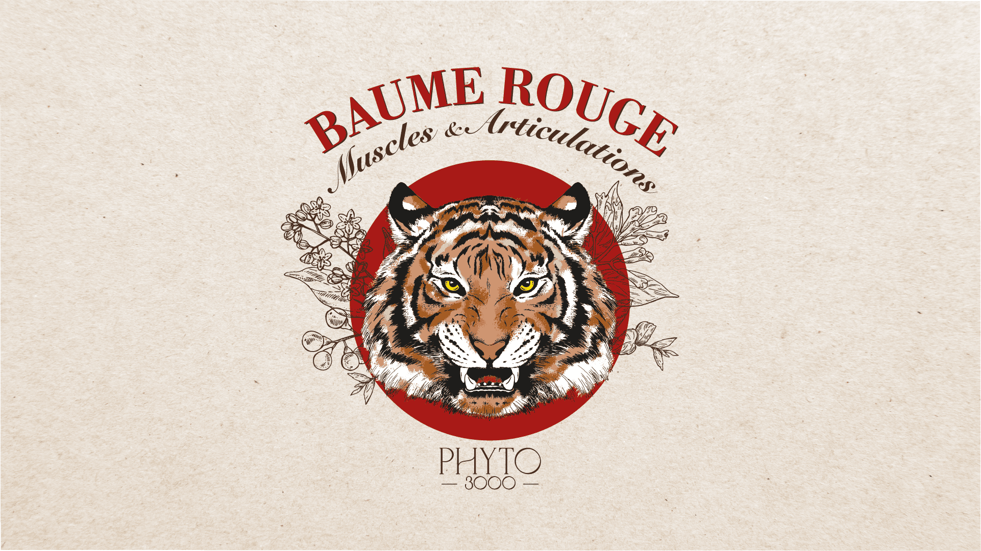
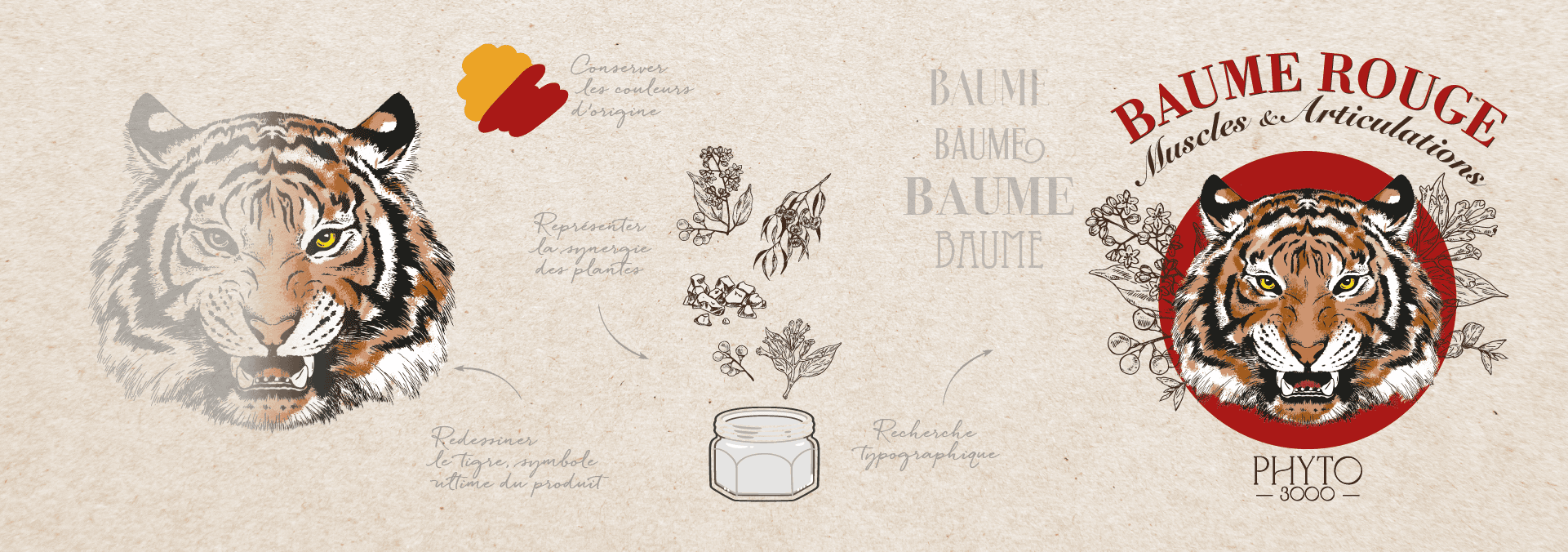
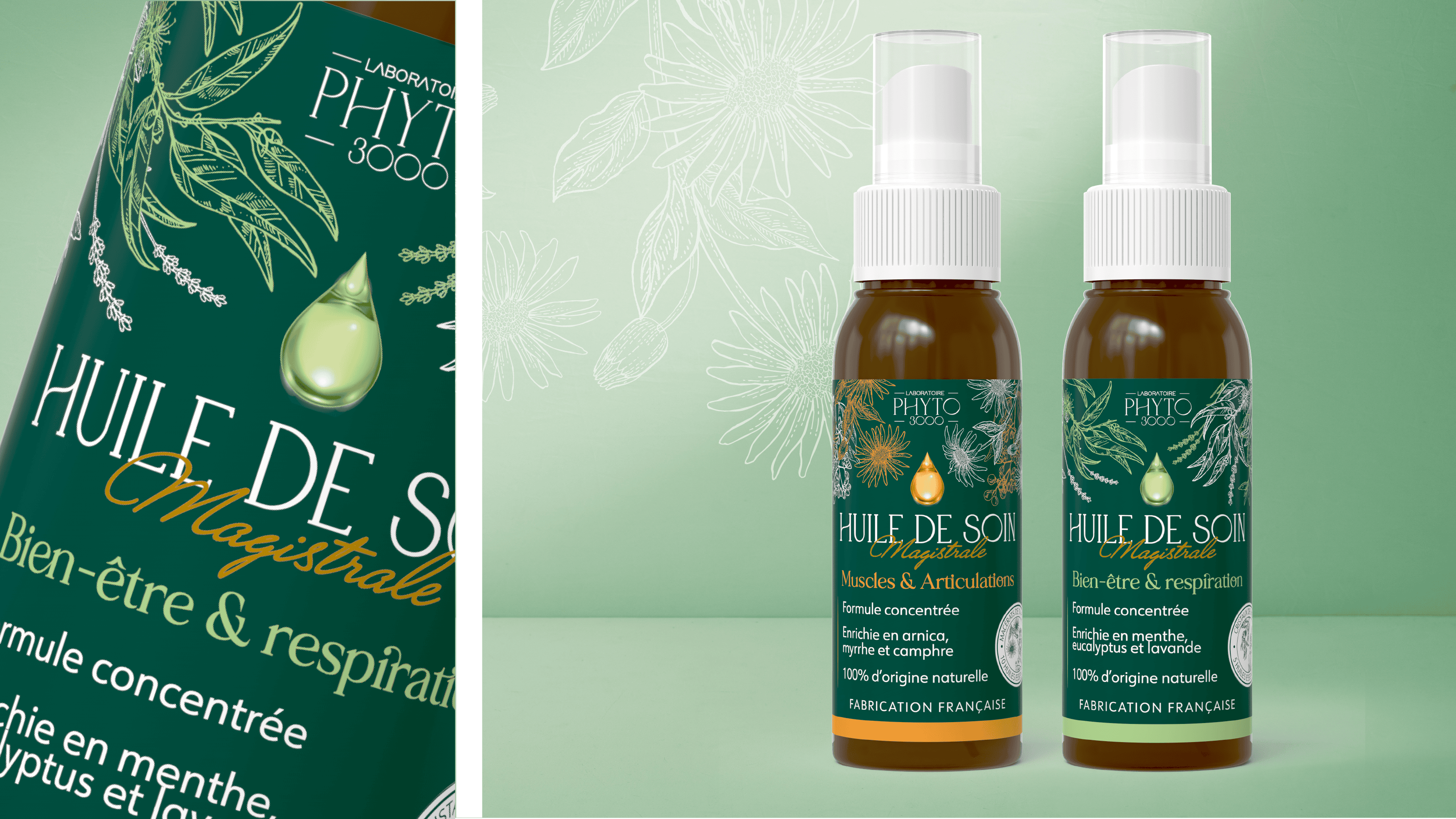
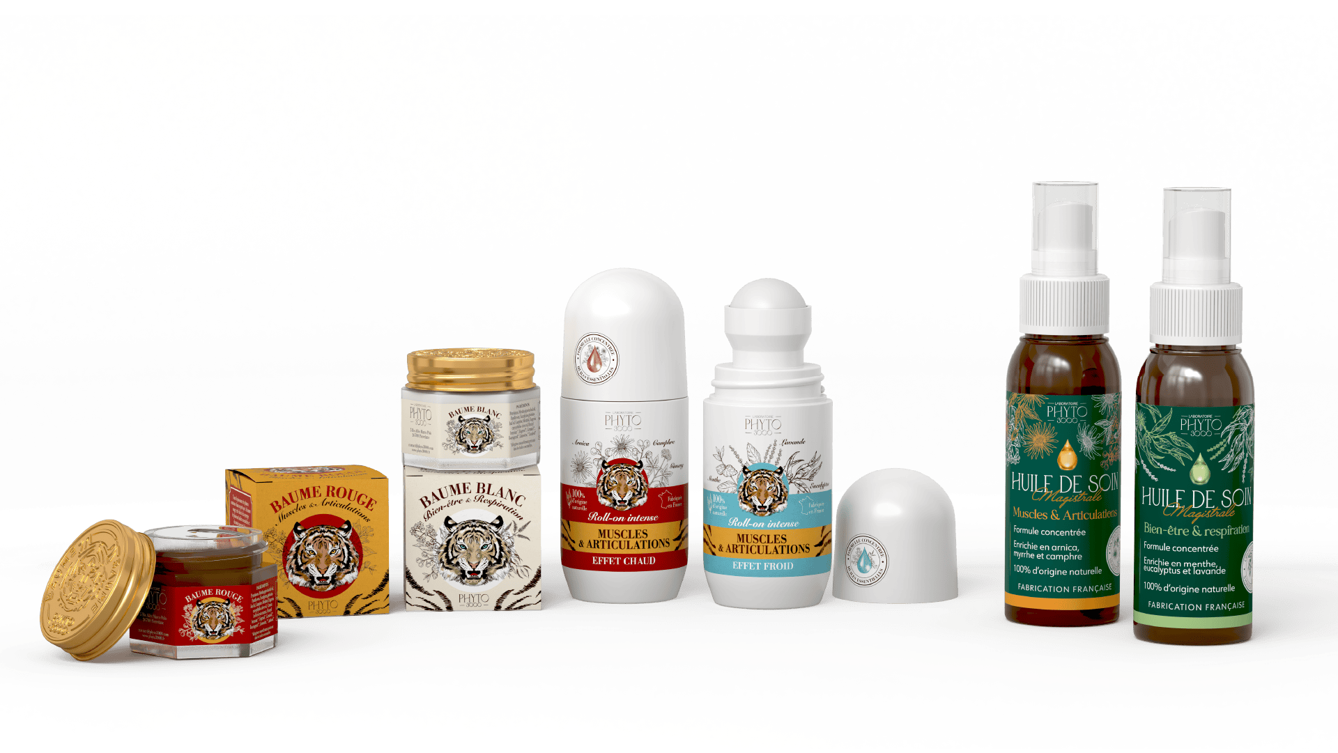
Balm: essential identity codes preserved (tiger skin, colored circle, animal head), illustration evoking botanical plates, subtler texture, more statutory typography. Oils: clear roll-on vs spray segmentation, color codes by effect, message hierarchy, active plants highlighted.
Two strategies, one grammar.
Problem solved. By design
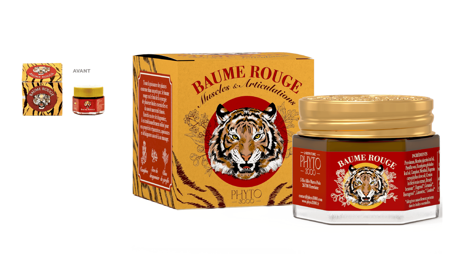
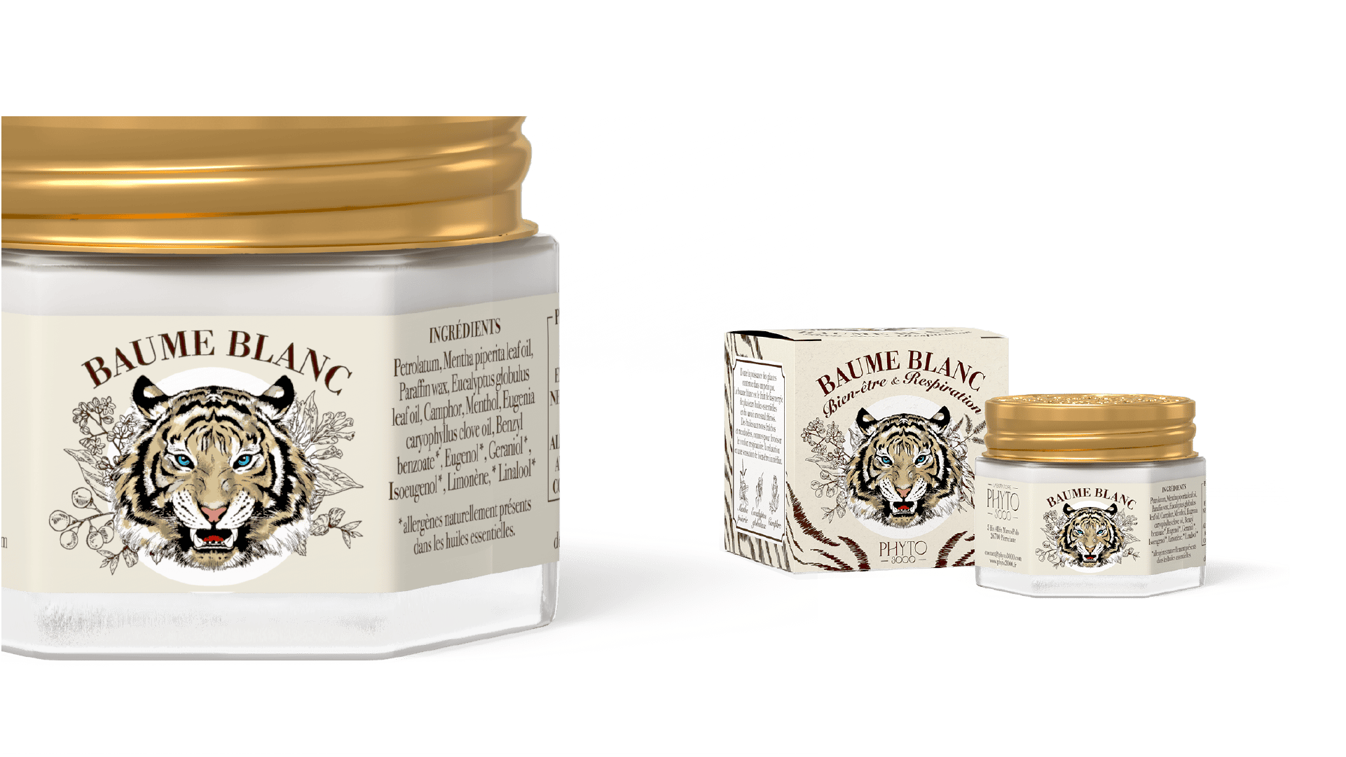
1 icon preserved, 1 icon elevated
The historic balm keeps its identity codes while gaining premium status.
Roll-on vs spray: 1 clear segmentation
Two range formats visually differentiated, without breaking the brand system.
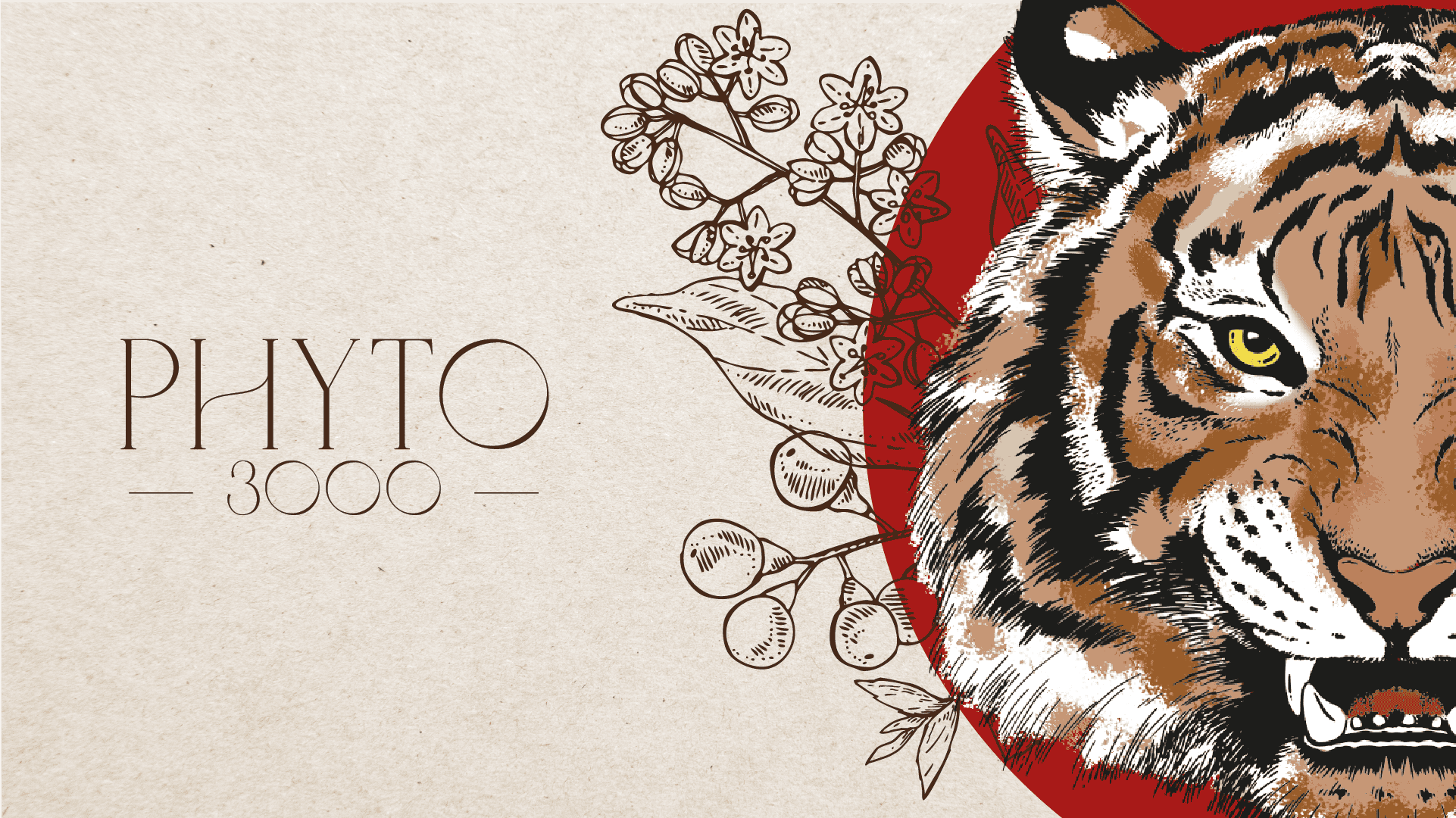
Botanical plates, custom typography
A new graphic territory, rooted in the brand’s phytotherapeutic heritage.
Expertise: Art Direction · Packaging Design · Illustration · Product Range Strategy · Typography Design · Product Repositioning
Phyto 3000 entrusted the repackaging of its cult balm and the clarification of its underperforming complementary oils.
Modernize a product identified for decades without losing recognition. Touch the balm and risk breaking with loyal buyers. Don’t touch it and let an icon age.
Balm: essential identity codes preserved (tiger skin, colored circle, animal head), illustration evoking botanical plates, subtler texture, more statutory typography. Oils: clear roll-on vs spray segmentation, color codes by effect, message hierarchy, active plants highlighted.
Two strategies, one grammar.
Problem solved. By design

1 icon preserved, 1 icon elevated
The historic balm keeps its identity codes while gaining premium status.
Roll-on vs spray: 1 clear segmentation
Two range formats visually differentiated, without breaking the brand system.
Botanical plates, custom typography
A new graphic territory, rooted in the brand’s phytotherapeutic heritage.
Expertise: Art Direction · Packaging Design · Illustration · Product Range Strategy · Typography Design · Product Repositioning
Phyto 3000 entrusted the repackaging of its cult balm and the clarification of its underperforming complementary oils.
Modernize a product identified for decades without losing recognition. Touch the balm and risk breaking with loyal buyers. Don’t touch it and let an icon age.
Balm: essential identity codes preserved (tiger skin, colored circle, animal head), illustration evoking botanical plates, subtler texture, more statutory typography. Oils: clear roll-on vs spray segmentation, color codes by effect, message hierarchy, active plants highlighted.
Two strategies, one grammar.
Problem solved. By design
1 icon preserved, 1 icon elevated
The historic balm keeps its identity codes while gaining premium status.
Roll-on vs spray: 1 clear segmentation
Two range formats visually differentiated, without breaking the brand system.
Botanical plates, custom typography
A new graphic territory, rooted in the brand’s phytotherapeutic heritage.
Expertise: Art Direction · Packaging Design · Illustration · Product Range Strategy · Typography Design · Product Repositioning