EN


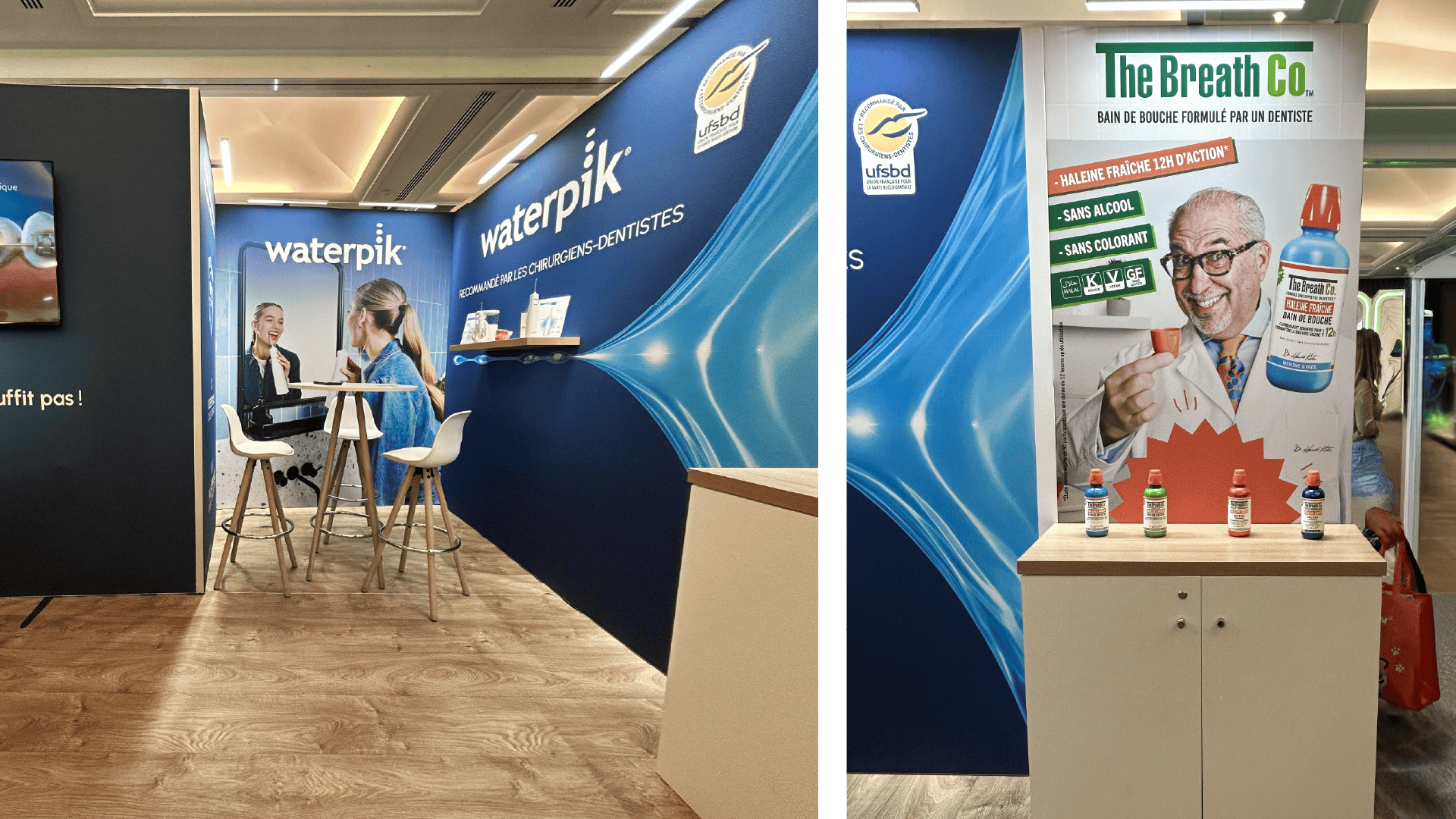
Waterpik was launching a new premium visual identity. The brief: make it real in a 215 sq ft trade show booth, shared with another brand from the group, The Breath Co. The risk wasn’t a lack of impact. It was dilution of the premium positioning in a constrained, multi-brand space.
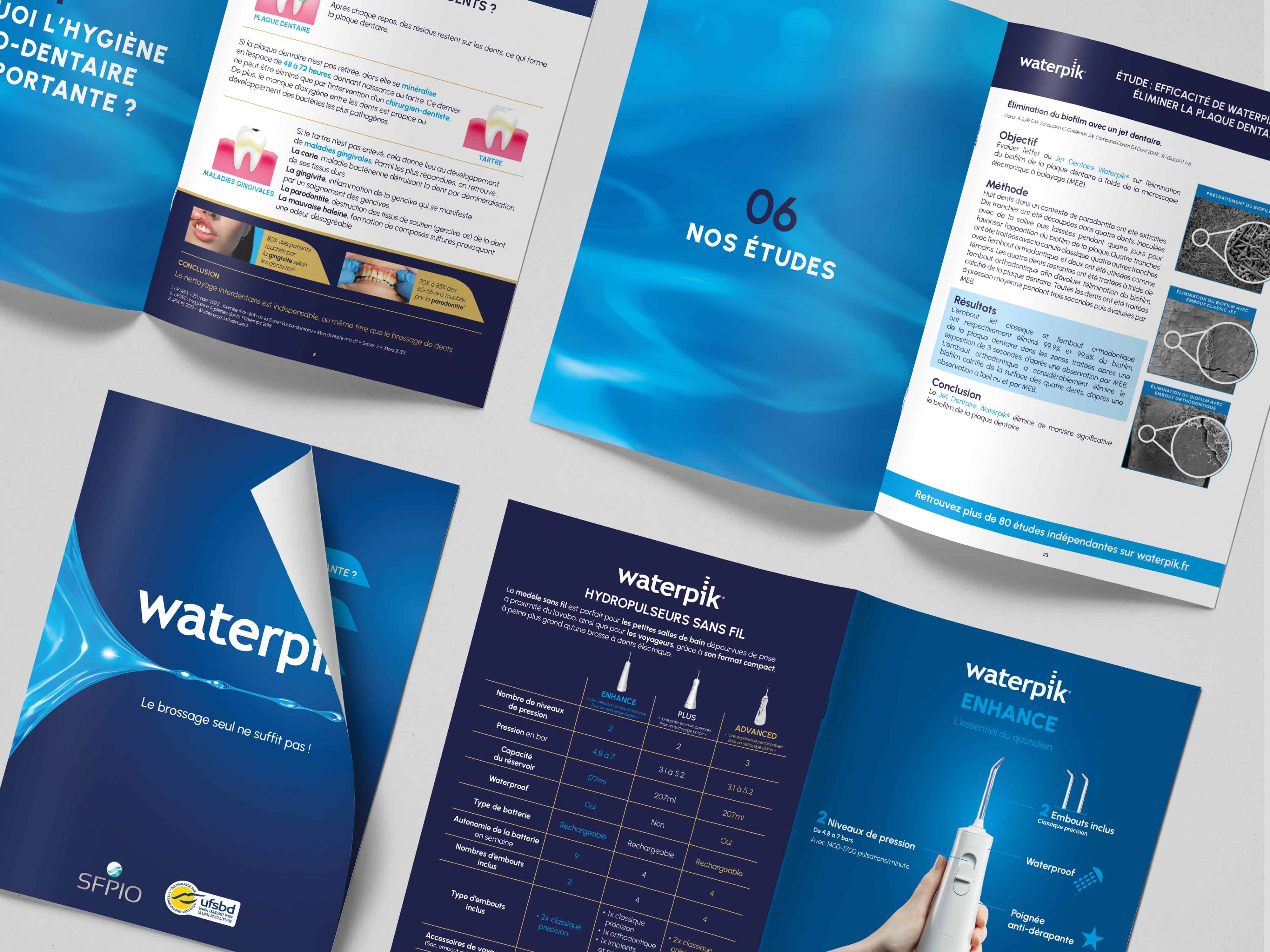
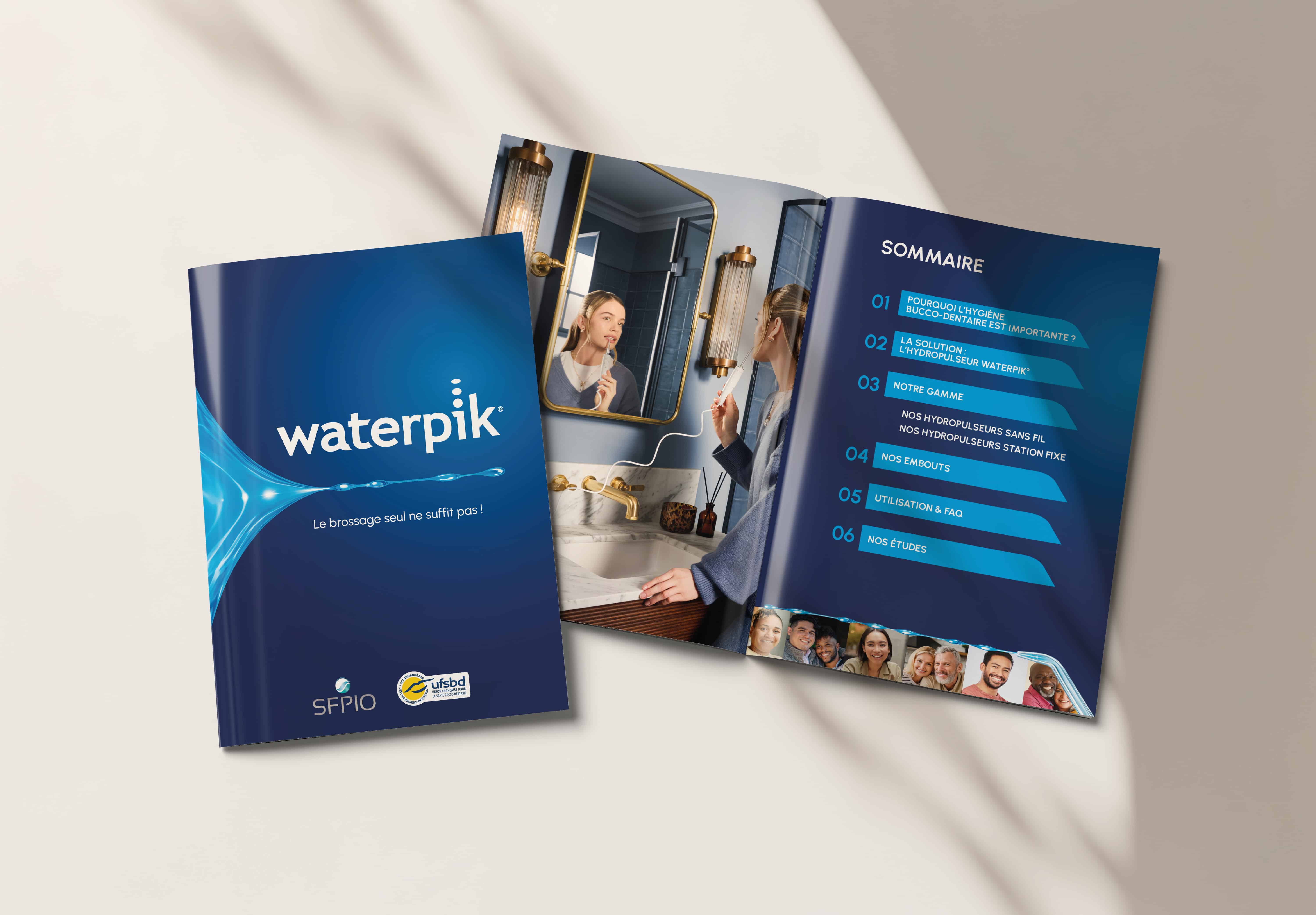
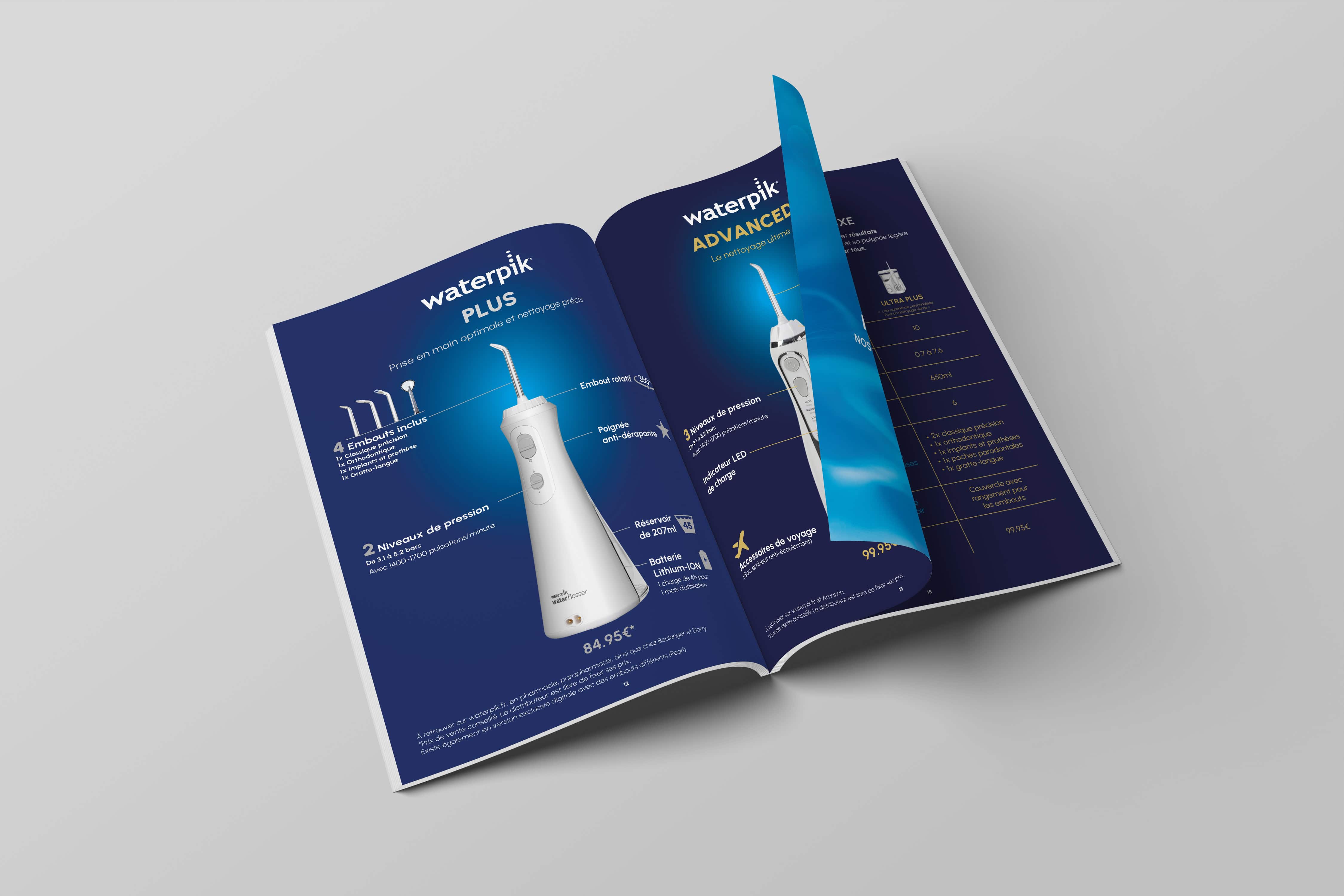
Three distinct zones: video welcome area, product testing with built-in sinks, discussion space. Deep blue as signature, cyan gradients as technological language. Seven sales support tools (leaflets, catalogs, prescription pads, signage) designed in strict continuity with the new identity. The Breath Co’s universe integrated in a distinct yet complementary layout, without visual compromise. High-resolution image processing for print-to-large-format adaptation.
Problem Solved By design
3 zones, 1 journey
A booth structured into three functional spaces (welcome, demo, conversation). Each one serves the visitor experience.
7 assets produced
Leaflets, catalogs, prescription pads, signage: all built from a single creative foundation. Ready for field activation.
2 brands, 0 compromise
Two brand universes integrated on one stand. Each legible, coherent, visually uncompromised.
Expertise: Spatial scenography · Large-format graphic design · Visual identity rollout · High-resolution image processing · Print materials · Signage · Multi-brand management
Waterpik was launching a new premium visual identity. The brief: make it real in a 215 sq ft trade show booth, shared with another brand from the group, The Breath Co. The risk wasn’t a lack of impact. It was dilution of the premium positioning in a constrained, multi-brand space.
.png)
Three distinct zones: video welcome area, product testing with built-in sinks, discussion space. Deep blue as signature, cyan gradients as technological language. Seven sales support tools (leaflets, catalogs, prescription pads, signage) designed in strict continuity with the new identity. The Breath Co’s universe integrated in a distinct yet complementary layout, without visual compromise. High-resolution image processing for print-to-large-format adaptation.
Problem Solved By design
.png)

3 zones, 1 journey
A booth structured into three functional spaces (welcome, demo, conversation). Each one serves the visitor experience.
7 assets produced
Leaflets, catalogs, prescription pads, signage: all built from a single creative foundation. Ready for field activation.
2 brands, 0 compromise
Two brand universes integrated on one stand. Each legible, coherent, visually uncompromised.
Expertise: Spatial scenography · Large-format graphic design · Visual identity rollout · High-resolution image processing · Print materials · Signage · Multi-brand management
Waterpik was launching a new premium visual identity. The brief: make it real in a 215 sq ft trade show booth, shared with another brand from the group, The Breath Co. The risk wasn’t a lack of impact. It was dilution of the premium positioning in a constrained, multi-brand space.
Three distinct zones: video welcome area, product testing with built-in sinks, discussion space. Deep blue as signature, cyan gradients as technological language. Seven sales support tools (leaflets, catalogs, prescription pads, signage) designed in strict continuity with the new identity. The Breath Co’s universe integrated in a distinct yet complementary layout, without visual compromise. High-resolution image processing for print-to-large-format adaptation.
Problem Solved By design
3 zones, 1 journey
A booth structured into three functional spaces (welcome, demo, conversation). Each one serves the visitor experience.
7 assets produced
Leaflets, catalogs, prescription pads, signage: all built from a single creative foundation. Ready for field activation.
2 brands, 0 compromise
Two brand universes integrated on one stand. Each legible, coherent, visually uncompromised.
Expertise: Spatial scenography · Large-format graphic design · Visual identity rollout · High-resolution image processing · Print materials · Signage · Multi-brand management