EN


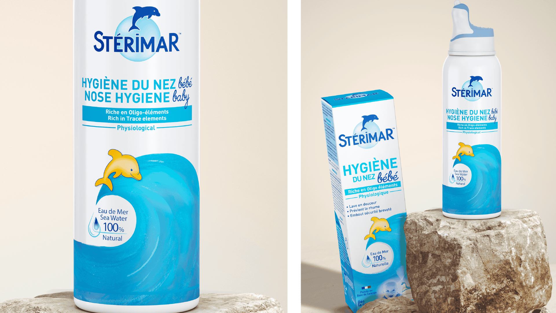
12 references, multiple format variations, a range that had become hard to read on shelf. Pharmacists didn't always know what to recommend.
The challenge: rethink the architecture so the range works as a prescription tool at the counter. Won in a competitive pitch.
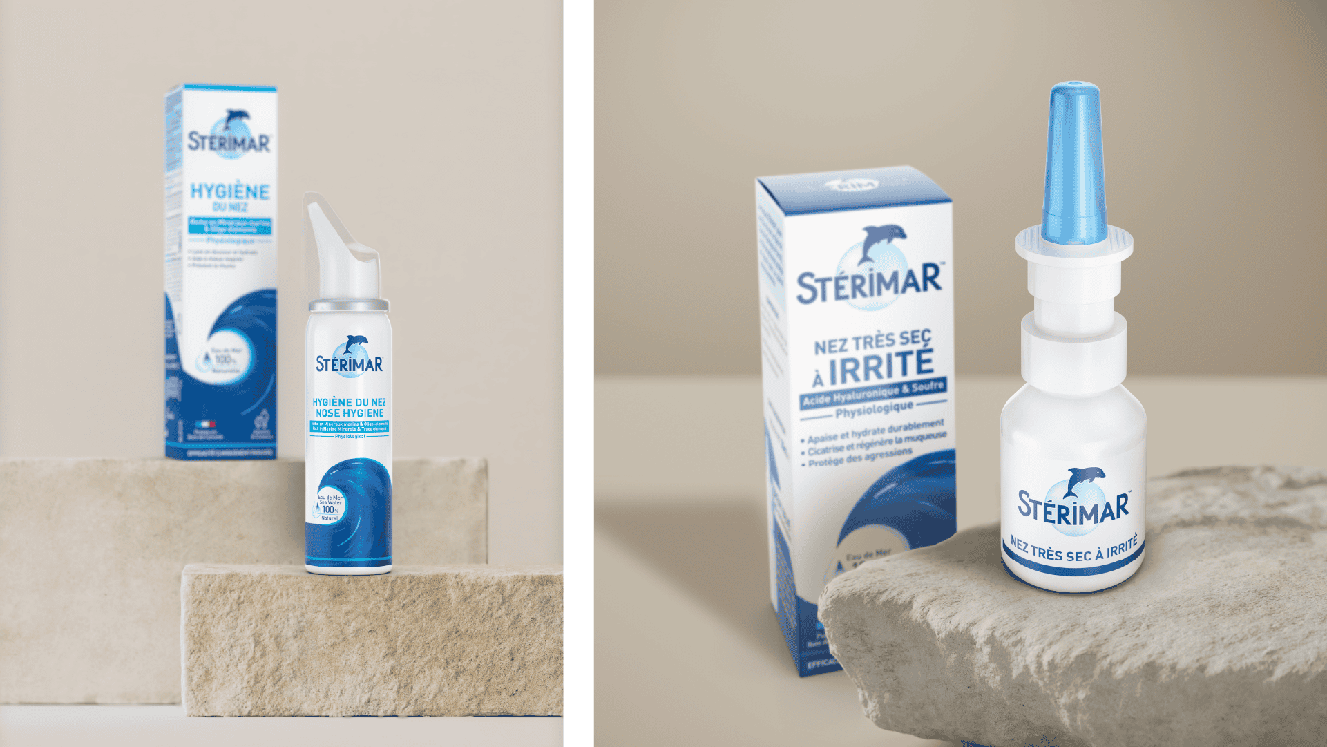
Starting point: counter cases. 4 color-coded families, tonal gradient for symptom intensity within each.
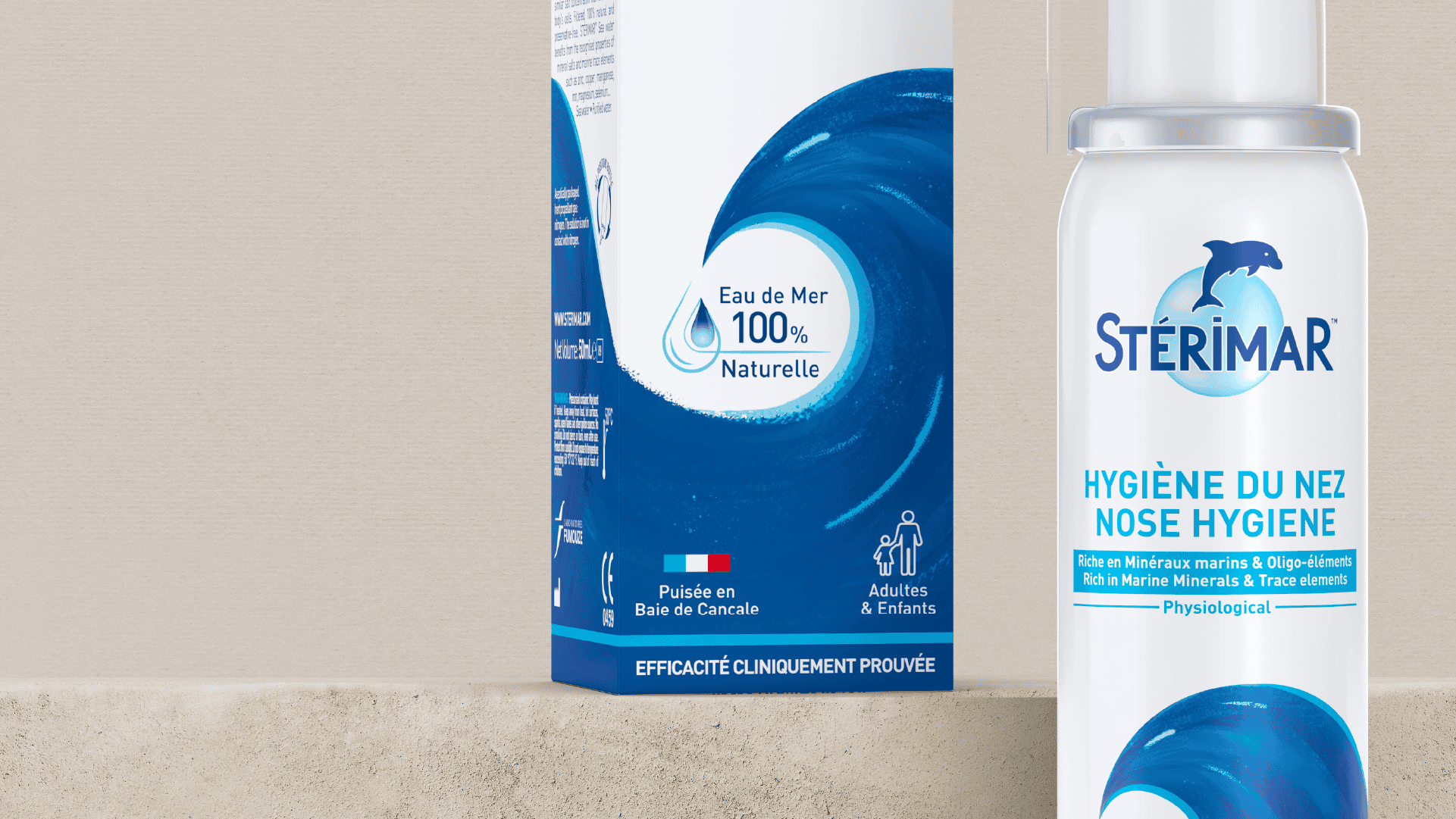
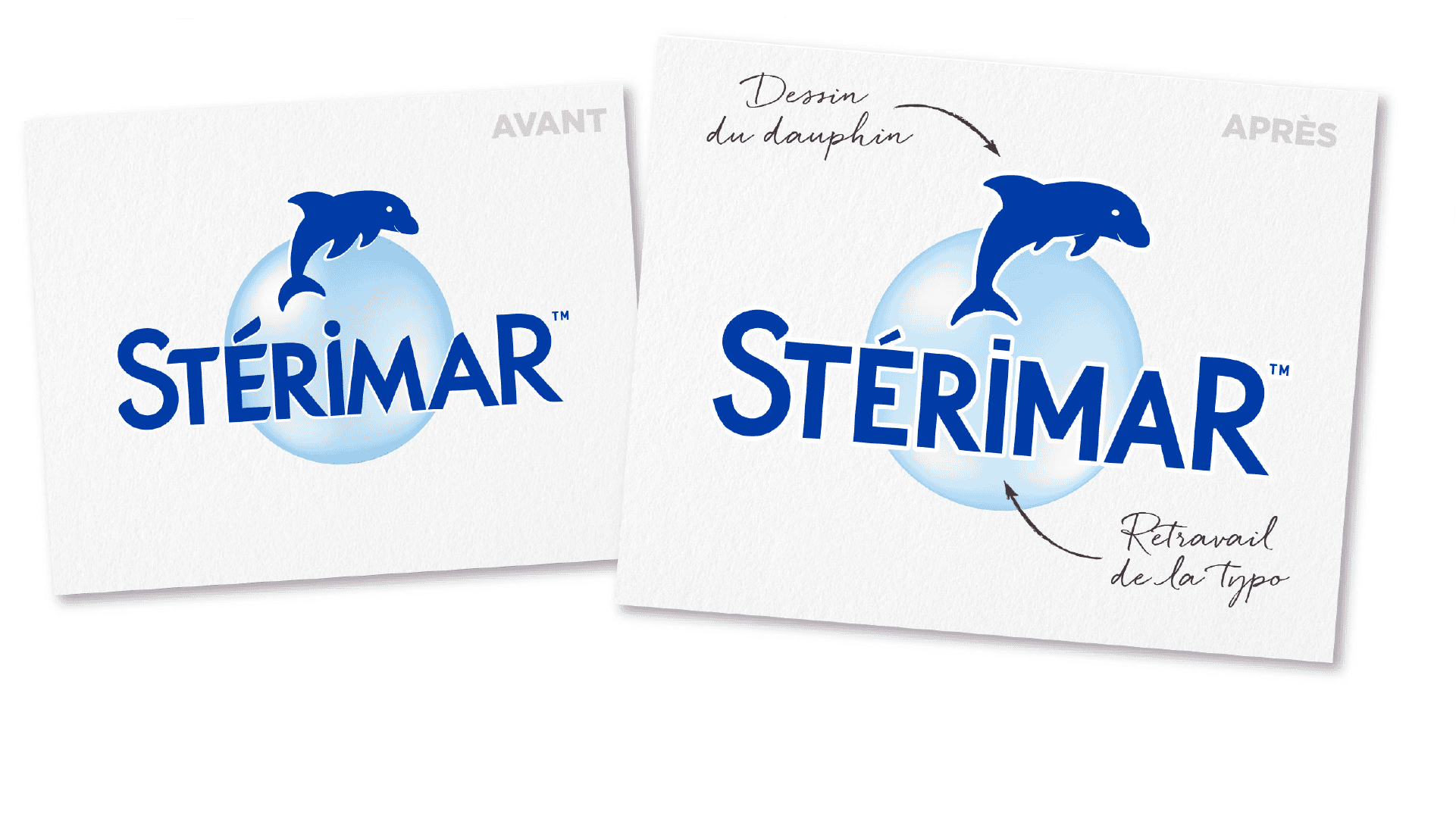
The pharmacist sees it, the consumer understands it. Pack structure preserved, codes modernized, softer natural palette, double-facing packs for international rollout.
Beyond packaging: brand guidelines, POS by segment, sales tools, print and digital assets, website elements.
One system. Deployed in France (Sofibel) and internationally (Church & Dwight).
Problem solved. By design.
12 references redesigned + format variations
4 color-coded families
International rollout, double-facing packs
Competitive pitch won, ongoing client relationship
Expertises : Brand identity • Packaging design • Product range architecture • Print • Digital
12 references, multiple format variations, a range that had become hard to read on shelf. Pharmacists didn't always know what to recommend.
The challenge: rethink the architecture so the range works as a prescription tool at the counter. Won in a competitive pitch.
Starting point: counter cases. 4 color-coded families, tonal gradient for symptom intensity within each.
The pharmacist sees it, the consumer understands it. Pack structure preserved, codes modernized, softer natural palette, double-facing packs for international rollout.
Beyond packaging: brand guidelines, POS by segment, sales tools, print and digital assets, website elements.
One system. Deployed in France (Sofibel) and internationally (Church & Dwight).
Problem solved. By design.
12 references redesigned + format variations
4 color-coded families
International rollout, double-facing packs
Competitive pitch won, ongoing client relationship
Expertises : Brand identity • Packaging design • Product range architecture • Print • Digital