EN


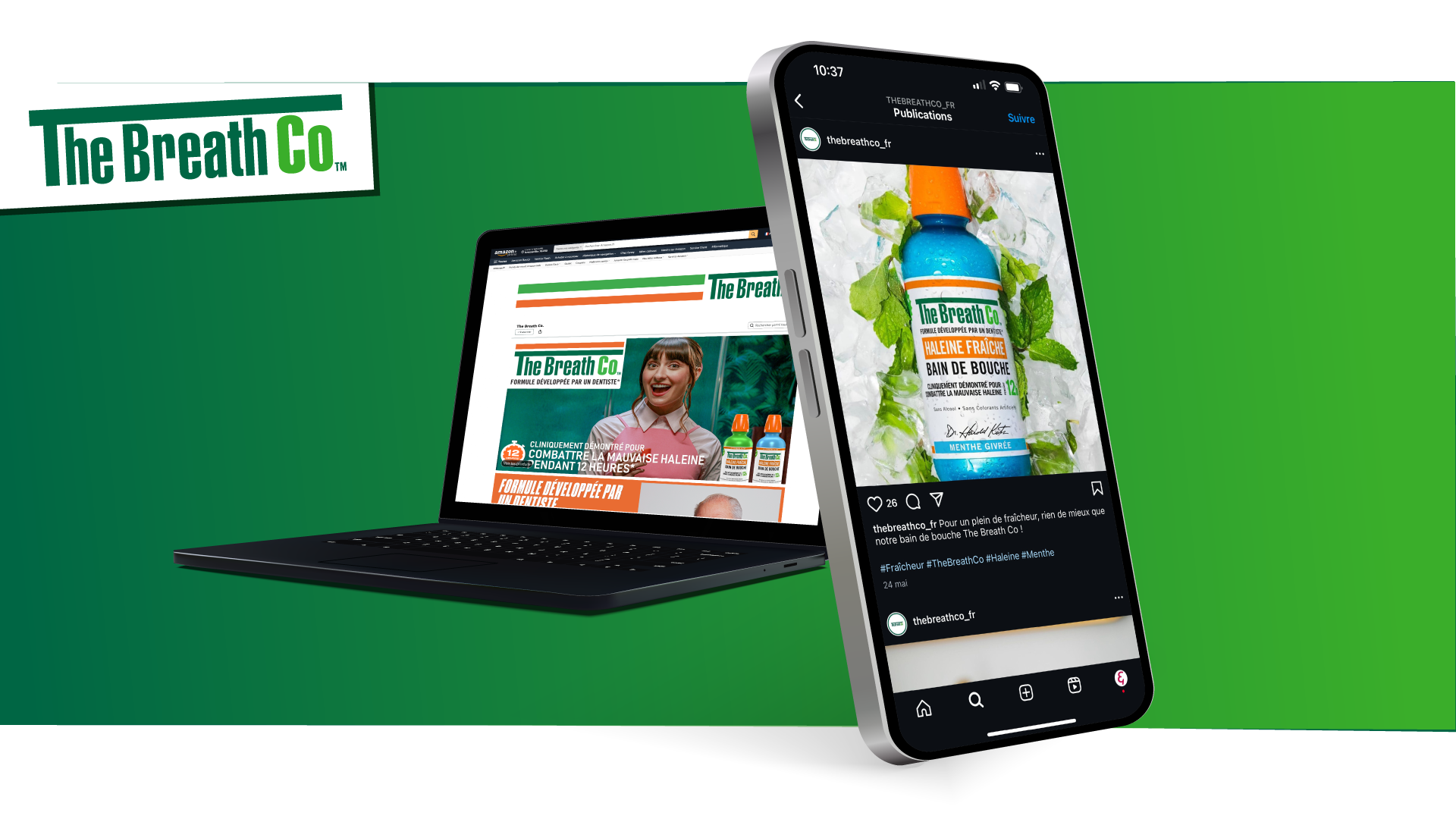
The Breath Co, Dr. Katz’s brand, entrusted Sign & Volume with its Amazon visuals.
A product born from a deeply personal story, with a unique positioning on an ultra-competitive market. Amazon’s codes impose strict constraints on readability and format. Very few brands survive them with their identity intact.
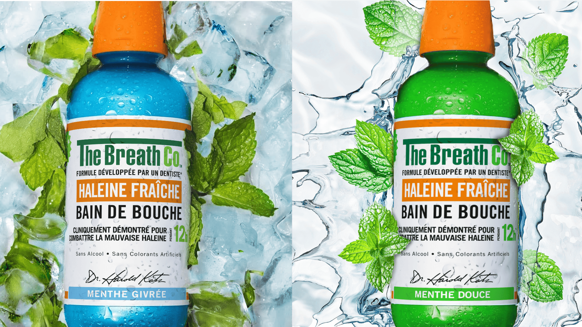
Starting point: Dr. Katz’s story (a father creating a product for his daughter). Every visual combines readability, attractiveness, and commercial efficiency. Graphic semantics adapted to e-retail, fresh and quirky tone. Expressions, metaphors, and icons for a memorable identity, within strict compliance of the global graphic charter.
Problem solved. By design
1 story, 1 thread
Dr. Katz’s founding story as the narrative driver behind every visual.
2 constraints, 0 concessions
Brand’s international charter and Amazon’s codes respected simultaneously. No identity lost.
Every visual built to convert
Readability, benefit hierarchy, scroll impact: art direction engineered for e-commerce performance
The Breath Co, Dr. Katz’s brand, entrusted Sign & Volume with its Amazon visuals.
A product born from a deeply personal story, with a unique positioning on an ultra-competitive market. Amazon’s codes impose strict constraints on readability and format. Very few brands survive them with their identity intact.
Starting point: Dr. Katz’s story (a father creating a product for his daughter). Every visual combines readability, attractiveness, and commercial efficiency. Graphic semantics adapted to e-retail, fresh and quirky tone. Expressions, metaphors, and icons for a memorable identity, within strict compliance of the global graphic charter.
Problem solved. By design


1 story, 1 thread
Dr. Katz’s founding story as the narrative driver behind every visual.
2 constraints, 0 concessions
Brand’s international charter and Amazon’s codes respected simultaneously. No identity lost.
Every visual built to convert
Readability, benefit hierarchy, scroll impact: art direction engineered for e-commerce performance


The Breath Co, Dr. Katz’s brand, entrusted Sign & Volume with its Amazon visuals.
A product born from a deeply personal story, with a unique positioning on an ultra-competitive market. Amazon’s codes impose strict constraints on readability and format. Very few brands survive them with their identity intact.
Starting point: Dr. Katz’s story (a father creating a product for his daughter). Every visual combines readability, attractiveness, and commercial efficiency. Graphic semantics adapted to e-retail, fresh and quirky tone. Expressions, metaphors, and icons for a memorable identity, within strict compliance of the global graphic charter.
Problem solved. By design
1 story, 1 thread
Dr. Katz’s founding story as the narrative driver behind every visual.
2 constraints, 0 concessions
Brand’s international charter and Amazon’s codes respected simultaneously. No identity lost.
Every visual built to convert
Readability, benefit hierarchy, scroll impact: art direction engineered for e-commerce performance